Aloha User Experience enthusiasts,
With the Hue 4 release we introduced a modern UI on top of our existing software to facilitate data discovery and analysis on premise and in the cloud.
The new UI organization
The new layout simplifies the interface and is now single page app, and this makes things snappier and unifies the apps together.
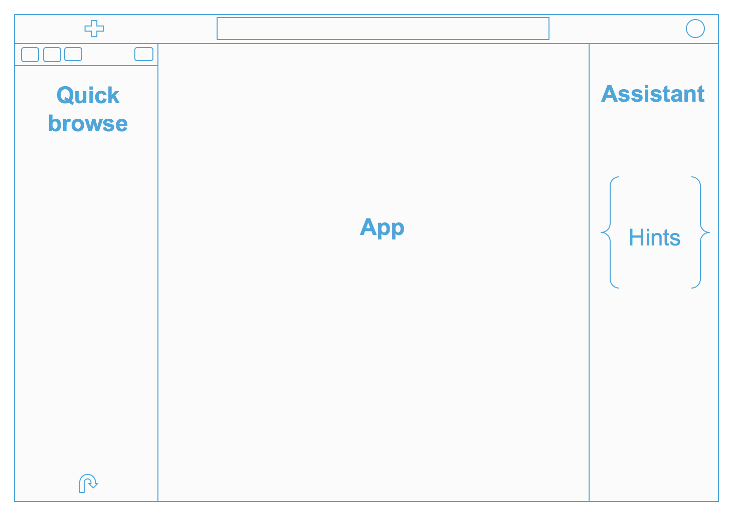
From top to bottom we have:
- A completely redesigned top bar, with a quick action (big blue button), a global search and a notification area on the right
- A collapsible hamburger menu that offers links to the various apps and a quick way to import data
- An extended quick browse on the left
- The main app area, where the fun is 🙂
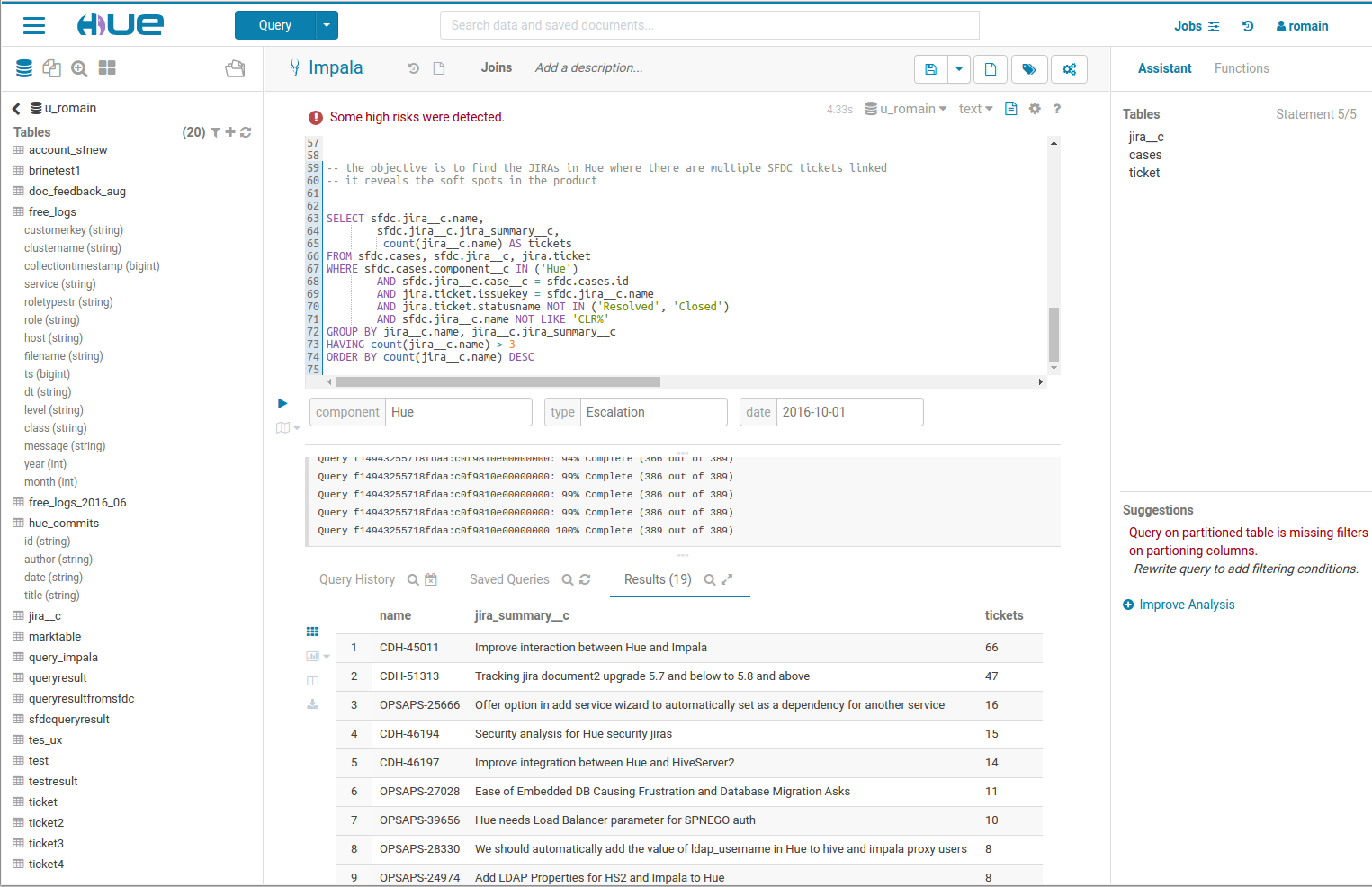
- A right Assistant panel for the current application. It's now enabled for the editors, and in case of Hive for instance, it offers you a live help, a quick browse for the used tables in your query, and much more: if your Hue instance is connected to a SQL Optimizer service like Cloudera Navigator Optimizer, it can offer suggestions on your queries!
Various applications have been grouped into 4 main conceptual areas:
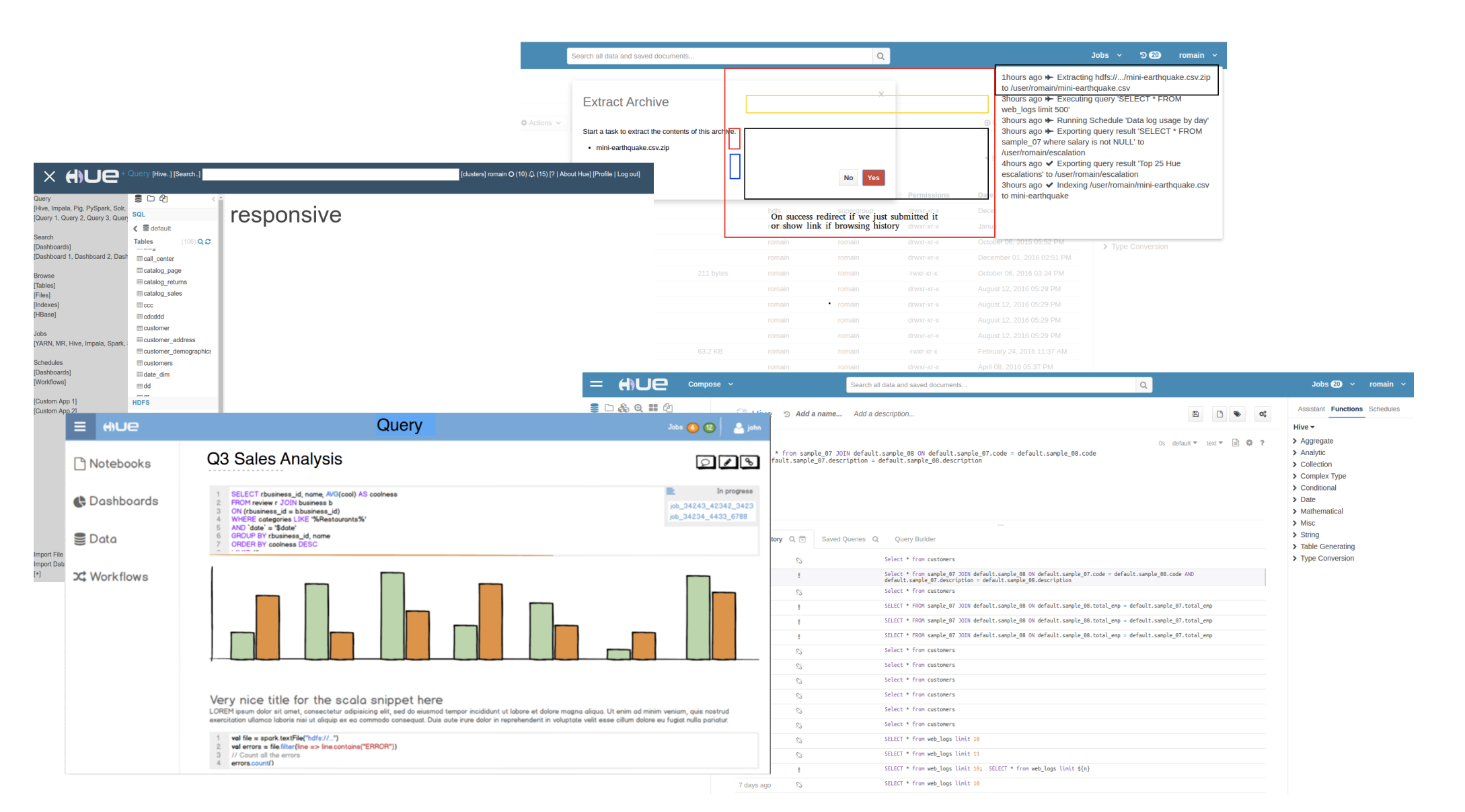
- Editor: The goal of Hue’s Editor is to make data querying easy and productive. It focuses on SQL but also supports job submissions. It comes with an intelligent autocomplete, search & tagging of data and query assistance.
- Browsers: Hue’s Browsers let you easily search, glance and perform actions on data or jobs in Cloud or on premise clusters.
- Dashboard: Dashboards are an interactive way to explore your data quickly and easily. No programming is required and the analysis is done by drag & drops and clicks.
- Scheduler: The application lets you build workflows and then schedule them to run regularly automatically. A monitoring interface shows the progress, logs and allow actions like pausing or stopping jobs.
The work on it started a couple of years ago and was incremental, and we applied a lot of the outcome of both design studies and customer feedback.
A few exotic locations helped on getting the inspiration:

Here it is, in all of its beauty 🙂
Quick search and browse
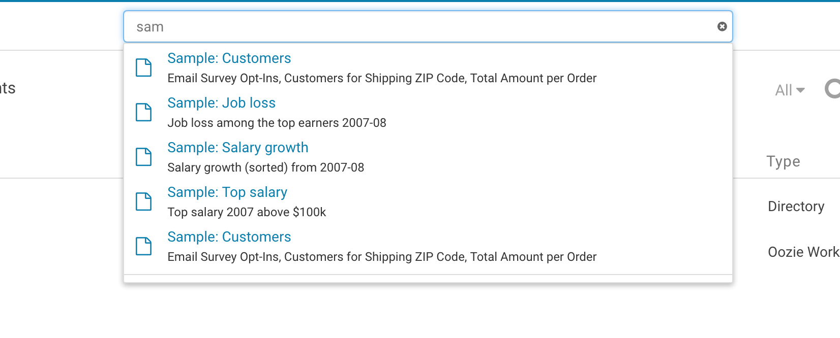
The new search bar is always accessible on the top of screen, and it offers a document search and metadata search too if Hue is configured to access a metadata server like Cloudera Navigator.
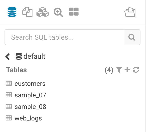
The improved quick browse on the left side of the screen now offers many more data sources and it is now enabled for Hive and Impala (like it was before) but also for HDFS, S3, HBase, Solr collections and Hue documents.
Default action / landing page
In Hue 4, every user is able to set their own preferred main action (the big blue button) and landing page. It just takes one click on the star next to the application name, like in this case next to Hive

The next time you will login, you will land directly into the Hive editor and a new query is always one click away.
Backward compatible
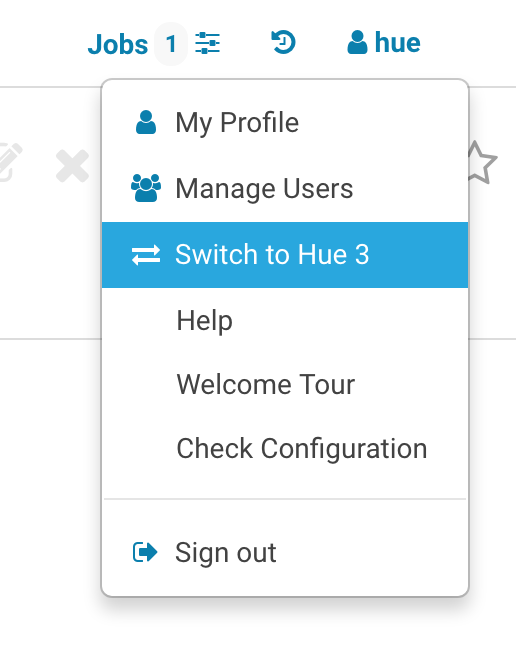
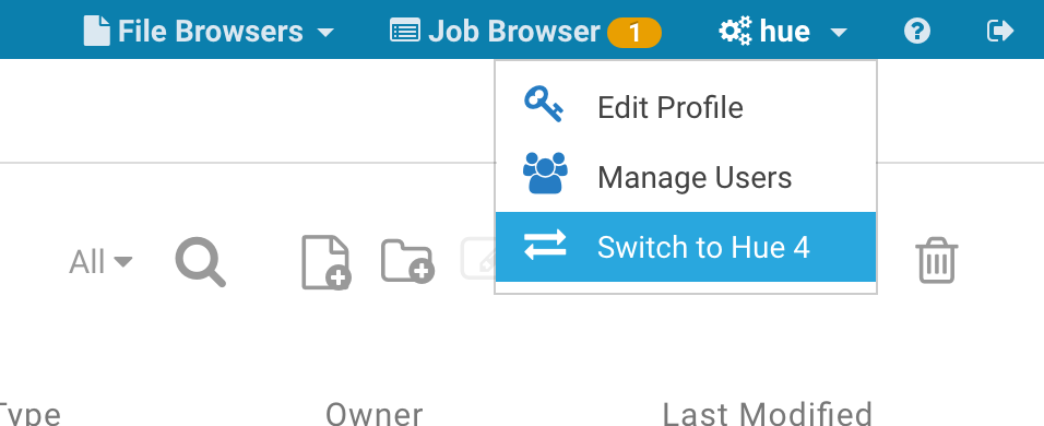
The older Hue 3 UI is still there and it's easily reachable just by clicking on ‘Switch to Hue 3/4’ from the user menu.
Administrators can also decide to enable/disable the new UI at a global level on the hue.ini or CM safety valve
[desktop]

\# Choose whether to enable the new Hue 4 interface.

is_hue_4=true
If you look at your browser's address bar, you will notice that all the URLs with the /hue prefix point to Hue 4. It is possible to just remove the prefix and land on the Hue 3 version of the page, e.g. /hue/editor (Hue 4) → /editor (Hue 3)
Now go try it on demo.gethue.com or download it if you haven't done it already!
Onwards!