Hi Big Data Explorers,
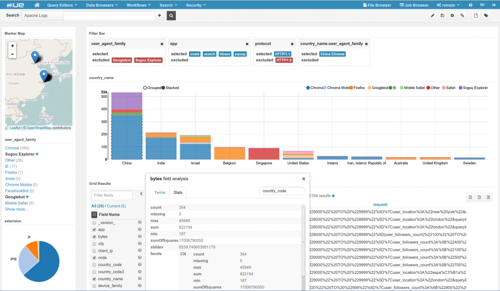
Hue Search dashboards introduced new ways to quickly explore a lot of data by drag & dropping some graphical widgets and leveraging Solr capabilities. The application received a lot of feedback and has been greatly improved.
Here is a short video detailing all the new stuff:
You can see a quick summary of the main novelties below:
Top Bar
It was re-organized in order to split widgets displaying records or facets.

Three new widgets
- Heatmap
- Tree
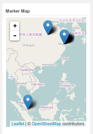
- Marker Map
Based on the Pivot facet feature of Solr, the Heatmap and Tree let you explore in 2D or nDimensions your data. For example you can plot the distribution of OS by Browser by country, IP by cities… They are both clickable, meaning you can filter the results by selecting certain values.


The Marker Map is great for automatically plotting the result rows on a leaflet.
Field analysis
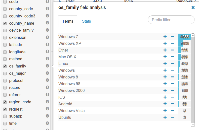
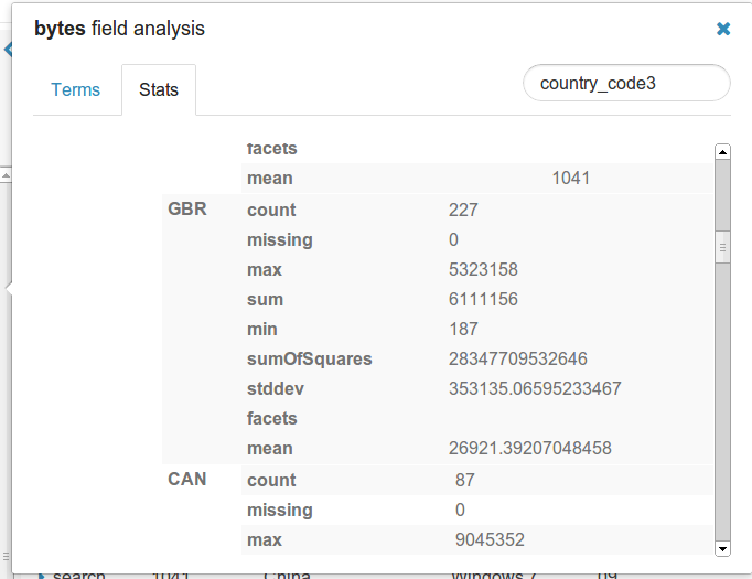
Index fields can now have their terms and stats retrieved in a single click. Accessible from the list of fields of the Grid Layout. Values can also be in/out excluded, prefix filtered or faceted by another field.
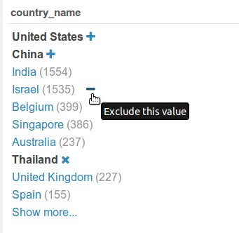
Exclude facets
Previously it was only possible to included selected facets. Now a little minus ‘-’ appears on hover on each value and let you filter out some values. These can be combined for filtering out some large values that make your graph difficult to read.

Note
The indexer is now smarter and will pick up the good ZooKeeper server: search examples are installable in one click (a few more clicks still with Kerberos/Sentry).
What’s next?
New facets like ‘this value & up!’, map plotting of new type of data, making it easier to create and index data, autocomplete (and ideally one day Analytics Facets) are in the pipeline!
We hope that you like the latest additions to the Search App. Feel free to continue to send us questions and feedback to the hue-user list or @gethue!

